
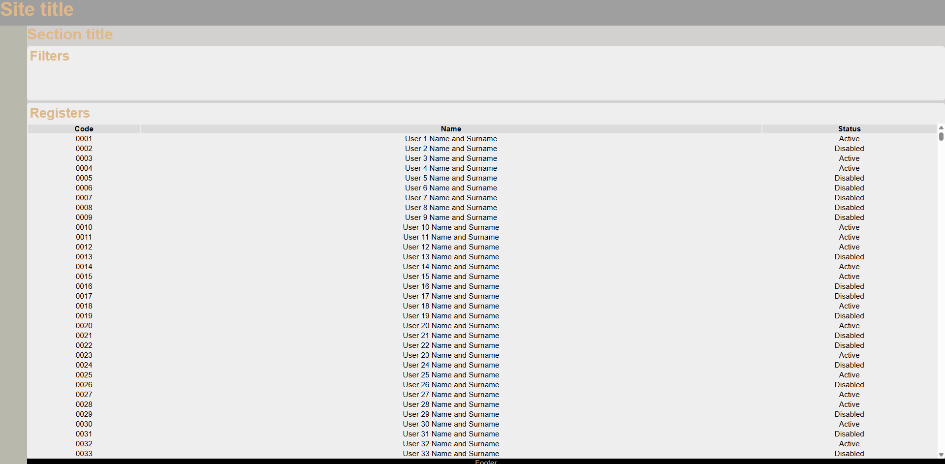
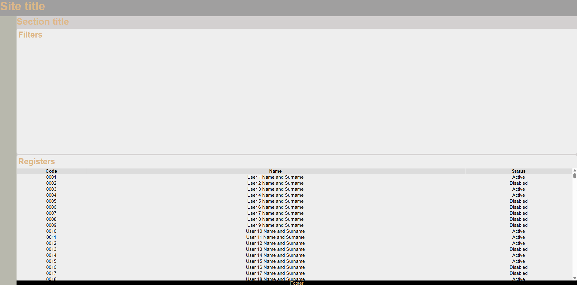
When generate GUI in HTML we have some unit types to define of size of elements. We can group in static units (px) and dynamic units (%, em, rem, vh/w). But more or less all units have a problem, the elements not adapt all fully as possible generating blank spaces or overflows.
But we can generate an style to enable the possibility to expand and use all free space. To use dynamic styles we must define the top parent element with static sizes to generate base reference values to calculate children dynamic values.
We are going to generate a layout with display type grid to define regions of template and it have the full size of screen with vh and vw (visual height and visual width).
Also we defined overflow as hidden to hide the content overflowed and not affect the design:
.layout {
  width: 100vw;
  height: 100vh;
  display: grid;
  grid-template-areas:
    "header header"
    "menu content"
    "menu footer";
  grid-template-columns: 50px 1fr;
  grid-template-rows: 50px 1fr 15px;
  overflow: hidden;
}
Code of example
<!DOCTYPE html>
<html lang="en">
  <head>
    <meta charset="UTF-8" />
    <meta name="viewport" content="width=device-width, initial-scale=1.0" />
    <title>Dynamic Layout</title>
    <link rel="stylesheet" href="style.css" />
  </head>
  <body>
    <div class="layout">
      <div class="header">
        <h1>Site title</h1>
      </div>
      <div class="menu">
        <nav></nav>
      </div>
      <div class="content dynamic-size">
        <h2>Section title</h2>
        <div class="filters section dynamic-size">
          <h3>Filters</h3>
        </div>
        <div class="registers section dynamic-size">
          <h3>Registers</h3>
          <div class="table-wrapper dynamic-size">
            <table>
              <thead>
                <tr>
                  <th>Code</th>
                  <th>Name</th>
                  <th>Status</th>
                </tr>
              </thead>
              <tbody>
              </tbody>
            </table>
          </div>
        </div>
      </div>
      <div class="footer">Footer</div>
    </div>
    <script>
      window.addEventListener("DOMContentLoaded", () => {
        PopulateTable();
      });

      function PopulateTable()
      {
        const table = document.getElementsByTagName("tbody")[0];
        for (let i = 1; i < 10000; i++) {
          const row = document.createElement("tr");

          const col1 = document.createElement("td");
          col1.innerText = `${GenerateCode(i)}`;
          row.append(col1);

          const col2 = document.createElement("td");
          col2.innerText = `User ${i} Name and Surname`;
          row.append(col2);

          const col3 = document.createElement("td");
          col3.innerText = Math.random() * 2 > 1 ? "Active" : "Disabled";
          row.append(col3);

          table.append(row);
        }
      }

      function GenerateCode(iteration)
      {
        let result = String(iteration)
        let difference = 4-result.length

        if (difference > 0) {
            for(let i=1; i<=difference; i++) {
                result ="0"+result
            }
        }
        return result
      }
    </script>
  </body>
</html>
* {
margin: 0;
padding: 0;
min-height: 0;
font-size: 14px;
font-family: Arial, Helvetica, sans-serif;
color: burlywood;
}
h1 {
font-size: 2.5rem;
}
h2 {
font-size: 2rem;
}
h3 {
font-size: 1.75rem;
}
h4 {
font-size: 1.5rem;
}
h5 {
font-size: 1.25rem;
}
h6 {
font-size: 1rem;
}
body {
background-color: #eee;
}
.layout {
width: 100vw;
height: 100vh;
display: grid;
grid-template-areas:
"header header"
"menu content"
"menu footer";
grid-template-columns: 50px 1fr;
grid-template-rows: 50px 1fr 15px;
background-color: orange;
overflow: hidden;
}
.dynamic-size {
display: flex;
flex: 1;
flex-direction: column;
overflow: hidden;
}
.header {
grid-area: header;
background-color: #a09f9f;
}
.menu {
grid-area: menu;
background-color: #b8b8ad;
}
.content {
gap: 5px;
grid-area: content;
background-color: #d3d0d0;
}
.footer {
grid-area: footer;
background-color: #000000;
text-align: center;
}
.section {
border-radius: 5px;
background-color: #eee;
}
.section > :is(h1, h2, h3, h4, h5, h6) {
margin: 5px;
}
.table-wrapper {
overflow: auto;
}
table > thead > tr > th {
background-color: gainsboro;
color: black;
}
table > tbody > tr > td {
color: black;
text-align: center;
}
.filters {
max-height: 100px;
}
Member discussion: